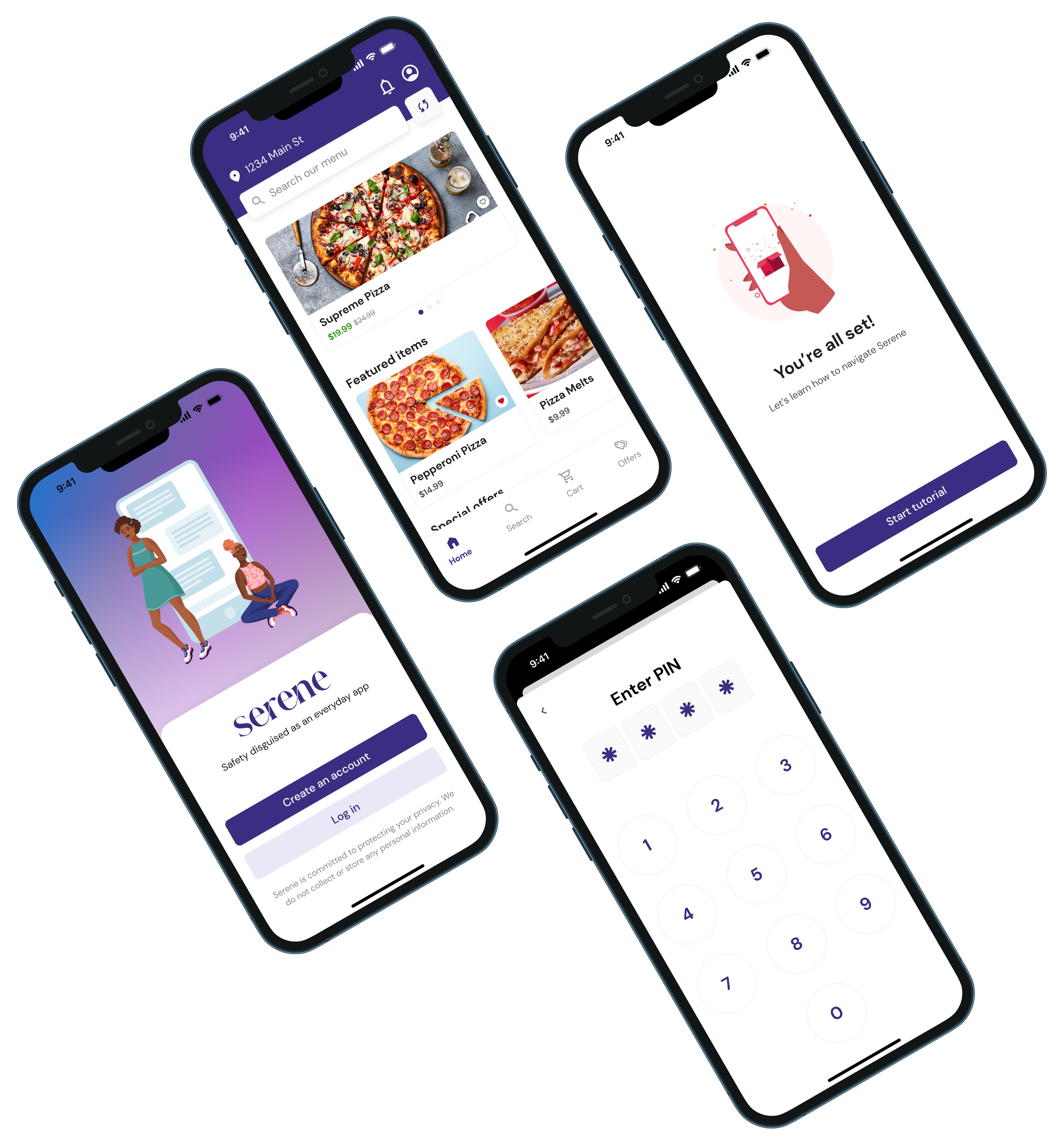
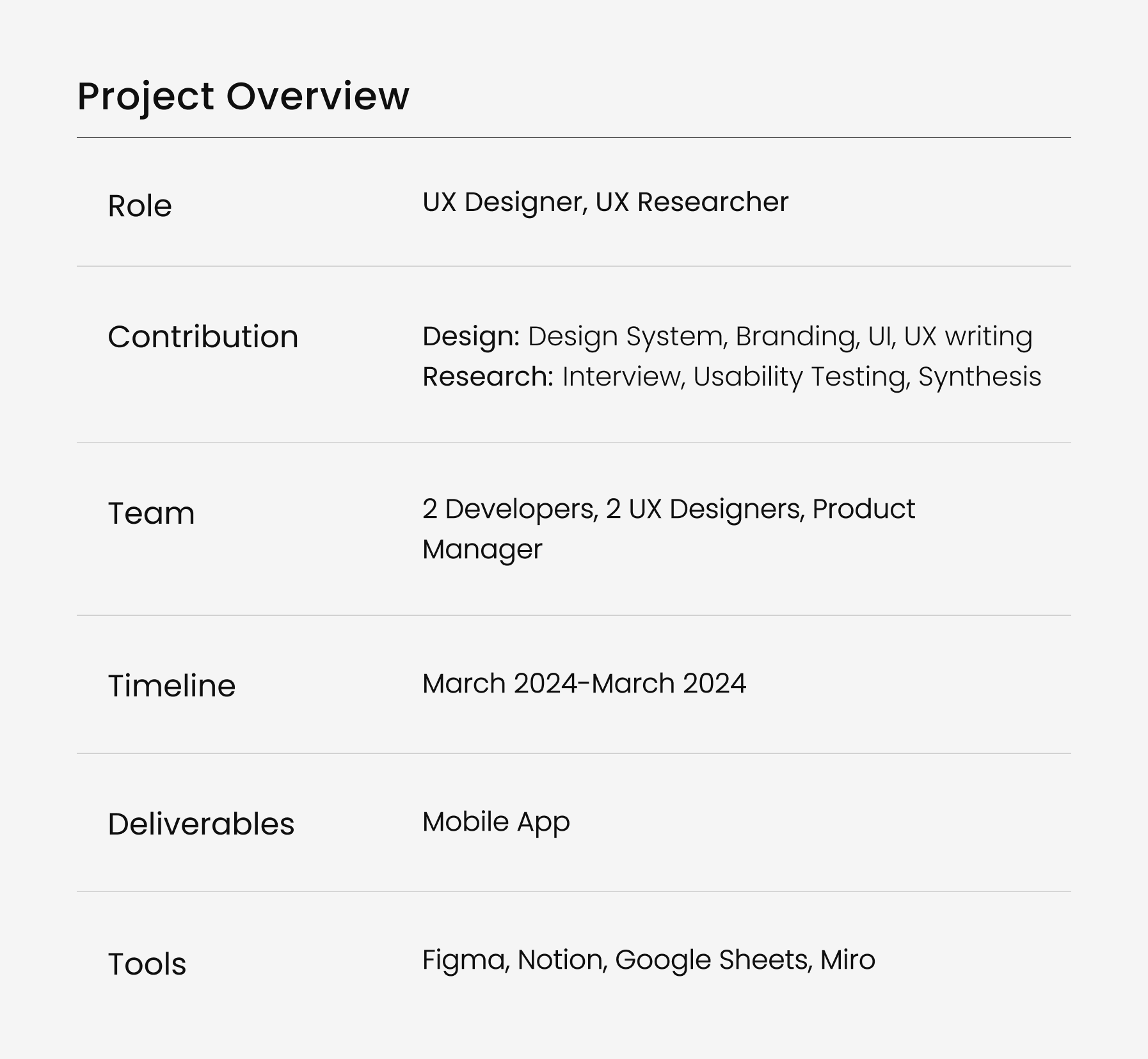
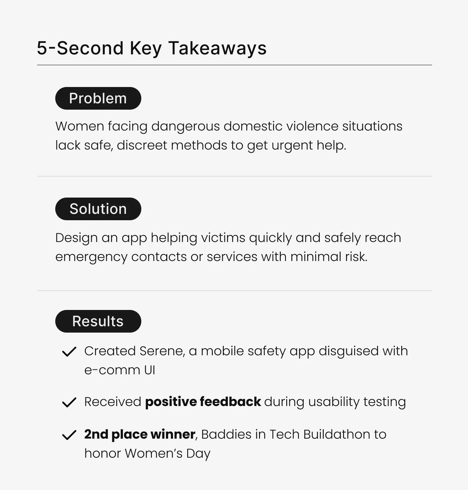
A safety app designed for women faced with threatening domestic violence situations.
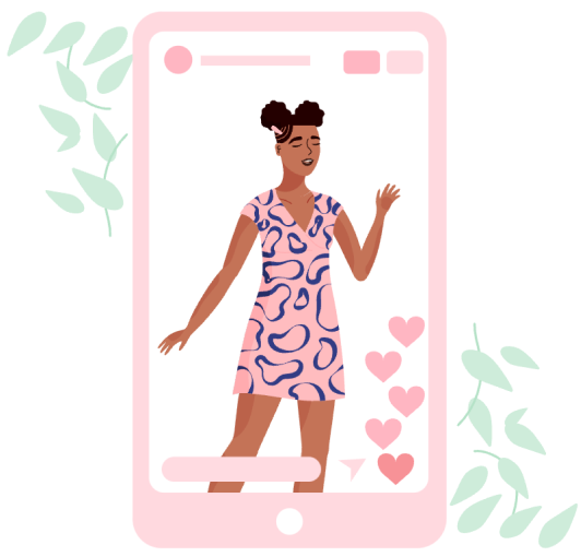
Discreet UI, posing as an e-comm app, featuring a hidden panic button.
Project Goals
Team up with developers to integrate AI into design
Design an intuitive product to instantly help victims
Focused on security, safety, and discretion
The final product
I put major emphasis on hidden safety features
App was designed to be intuitive for an emergency event
I helped emphasize the importance of UX writing; concise copy is critical in the event of an emergency
Here is a link to the Figma prototype if you’d like to click around and explore!
Case Study Navigation
click on any button to jump to specific section
Research and Discovery
As the UX sole researcher, I reviewed survivor stories, aligning with the product manager to better understand the main challenges that victims face and design for their potential needs.
Here are some alarming statistics:
3/10 women are stalked, physically assaulted, or raped by an intimate partner at some point in their lives. National Library of Medicine
phone calls are made daily to violence hotlines nationwide. National Domestic Violence Hotline
Intimate violence accounts for 15% of all crime. National Coalition Against Domestic Violence
Quantitative Secondary Research
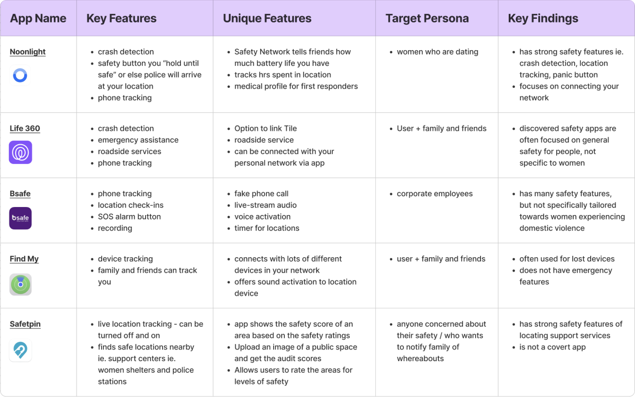
Competitive Analysis
From the analysis I was able to identify key features offering security and safety:
Identify existing UX design solutions and functionalities
Gain insights into user preferences and pain points
Learn from past successes and failures
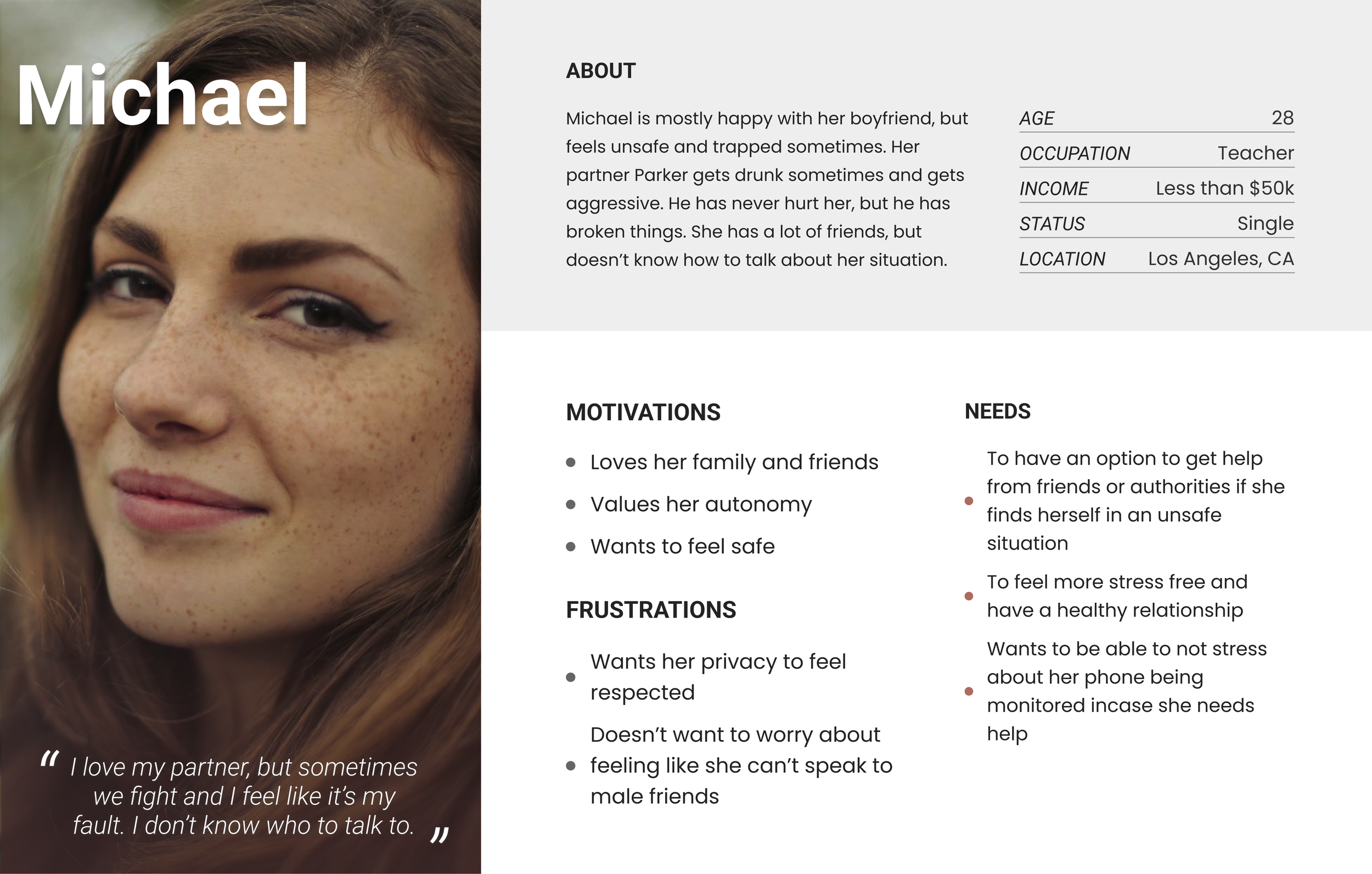
User Persona
Based on the survivor stories and the competitor apps, I created a persona to help the team build empathy for our target user demographic.
Lo-Fi Prototyping
These initial wireframes served to outlining the key features and user flows during the early stages of design.
Onboarding / Tooltips
I suggested we incorporate tooltips to help guide users through navigation and include a tutorial in the profile menu for a walkthrough.
Hidden features
Originally, we included a map to "track an order," allowing users to monitor police response time, research revealed this was not feasible, prompting its removal in hi-fi prototype.
Hi-Fi Prototyping
Login + Onboarding
I suggested purple as brand color representing trust and security.
After iterating, the panic ‘question mark’ icon changed to a ‘bell’ icon for better representation of security, safety, and emergency.
I suggested we use iconography to help make the design intuitive
Users prompted to select interests to generate realistic UI through gen-AI, while being mindful of not asking for any personal info.
Application Tutorial
The tutorial is mandatory during onboarding to guarantee that users would be familiar with the app prior to an emergency.
Panic Button & Profile Settings
Users can input health info in their profile settings to provide additional context in the event of an emergency for response teams
Labeled “Notification settings“ rather than “panic button” or “emergency alert”, to maintain covertness
Red colored panic icon button specifically not used to avoid suspicion
I suggested purple as brand color representing trust and security.
I specifically included the personal info at the end of the tutorial AFTER establishing trust with the user.
Usability Testing
For usability testing, our PM recruited participants with second-hand experience and was careful to maintain sensitivity and privacy.
I designed the user testing session with interview questions in tandem with the think-aloud approach.
The pilot test session provided valuable insights, helping us refine the app for better UX among those affected by domestic violence.
Interview Questions & Q + A Spreadsheet
Guiding Research Questions:
Is the application intuitive?
Do users adopt and trust the Gen-AI?
Is the interface covert yet intuitive to navigate?
Do users perceive the application as high risk?
Affinity Map
While we were only able to pilot the interview with one user testing session due to time constraints, the interview and affinity map were helpful for our team to implement feedback. Keep scrolling to see the key findings below!
Key Findings from Affinity Mapping
Ease of Use: Onboarding process was quick and straightforward, navigated tutorial effortlessly. Interface “clear and discoverable”. Refresh button on home screen added a unique feature. GenAI received positive feedback, enhancing safety features.
Security: Panic Button was loved, however user suggested message personalization and enhancing notification security.
Account Creation and Profile Settings: Recommendations: explain relevance of certain questions, enhancing profile settings ie. details about children, pets, and nearest urgent care.
Panic Button: Suggestions involve adding a personal message option, refining the notification system, and providing more context, especially for situations involving children.
Issues/Bugs: The user reported a profile button functionality issue on screens other than the main screen, highlighting the need for consistent app performance.
Summary: While praising ease of use and innovative features, improvements are needed in customization, security, and addressing specific concerns for a better user experience.
Design Changes Based on Usability Testing Findings
Here are some of the major changes we made after user testing:
Feedback: User was unsure of how the gen-AI model worked. User was confused about questions regarding their food choices and shopping interests.
Solution: Improved the copy on onboarding screen to better explain how app uses AI to generate a disguised interface.
AI Explanation
Feedback: User wanted option to add info to provide more context for emergency services.
Solution: Added questions in Settings:
Have children? If yes, do they live at home?
Do you have pets?
Who is your primary care doctor?
What is the closest urgent care or hospital?
Targeted Support
Intuitive UI
Feedback: User said the notification bell icon might draw unwanted attention, causing the victim have get their phone taken away
Solution: Changed notification icon to outlined instead of filled. A filled bell usually indicates unread notifications. Changing to outlined implies there are no notifications, meaning there would be no reason for an abuser to monitor the app.
Needs Clarity
Feedback: User isn’t sure what information is being sent out to police and emergency contacts
Solution: Added a disclaimer in profile settings to state what information will be sent out.
Key Takeaways & Recommendations
Add a dedicated resources page linking info ie. non-profits offering services for victims.
1.
Conduct usability testing with more stakeholders ie first responders, emergency contacts to consider user needs and improvements.
2.
Explore and add more accessibility features ie. landscape orientation, color contrast, alt text.
3.
Refine gen-AI models based on user input to improve UI disguises, and reduce risks for victims.
4.
Continuously improve UX design, supporting the real needs of victims affected by domestic violence.
5.
Thanks for Reading


